

 271
271 Why does a website today without Mobile-First design look like a shop window that someone forgot to open?
If you're a business owner in Ukraine and your website needs to generate leads (and not just "be online"), then this section is for you. We'll explain why below. mobile first design — not a trendy term, but basic hygiene: how mobile traffic became the dominant factor, why user expectations have risen, and how this impacts conversion and Google visibility. In short: without mobile-first, your site looks like a display case that someone forgot to open—people pass by, even if the product is excellent.
| What's happening | If Mobile-First is | If there is no Mobile-First |
|---|---|---|
| First contact with the site | Fast, clear, clickable | Small text, "hard to hit with a finger", irritation |
| Conversion | The user reaches the application/payment stage | The user is "merged" on the first screen |
| Visibility on Google | More stable growth, easier to scale SEO | Weaker behavioral signals make it harder to hold positions |
Fits: online stores, local services, B2B with lead generation, startups with paid traffic.
Not suitable: only if your site is a closed portal for employees and they are comfortable using only a PC (and even that is debatable).
Ukraine: Mobile is the "first screen of reality"
Based on our observations in Web-Raketa projects, users in Ukraine often encounter brands via smartphones: Google, maps, social media, instant messaging, and ad clicks. And then everything is decided in seconds: either "Oh, convenient, I get it," or "I'll check it out on my laptop later" (spoiler: later doesn't happen).
Developing a responsive website isn't about "reducing the blocks and voila." It's about scenarios: how a person searches, compares, calls, messages on Telegram, places an order, and plans a route.
User Expectations: Finger, Speed, and No Surprises
Today's mobile user isn't a romantic. They won't treat your 12px font like an art object. They want to quickly understand who you are, what you offer, how much it costs, and how to contact them. And here, mobile-first design acts as a filter: we retain only what motivates action.
- Buttons and forms are large, logical, without unnecessary fields.
- Content - short, to the point, with structure.
- Navigation is not a quest, but a route.
Conversion and Google: No Magic, Just Mechanics
Google has long evaluated the quality of the mobile experience based on speed, layout stability, and ease of use. If a site loads slowly or "jumps" when loading, it impacts user behavior, and user behavior impacts visibility. There are no "secret techniques"—simply the economics of attention: the less friction, the higher the chance that traffic will convert.
The mobile version isn't a "simplified" version. It's the only one most people will actually see.

Mobile-first design: What it means in practice (and why it's not just "make the buttons bigger")
Mobile first design is a way of thinking, not just cosmetics.
In practice, mobile-first design doesn't start with "make the buttons bigger," but with an honest answer: what should a user do on a website in the first 20-40 seconds of using a smartphone? Call? Submit a request? Find a price? Check availability? If at that point they have to pinch-zoom the screen with two fingers, search for a menu like an Easter egg, and close three pop-ups, the flow is broken, even if "everything looks great on the desktop."
At Web-Raketa, we view mobile-first as a matter of prioritization: first, we make the mobile user journey short, clear, and fast, and then we expand it to tablets and desktops. This is a strategy, not chaos—otherwise, design becomes a series of compromises.
This thought is a sobering one when a team wants to start with the “big screen” and leave mobile for “later” (a classic example of the genre).
Content Hierarchy, Speed, and Accessibility: The Three Pillars of Conversion
Mobile-first is about what's important to show first, what's second, and what doesn't need to be shown on the first screen at all. Content hierarchy directly impacts conversion and how SEO works for businesses: Google sees behavior, and users vote with their fingers—whether they stay or leave.
- Scenarios: one main CTA on the screen, logical steps, minimal distractions.
- Speed: light images, neat fonts, no “heavy” effects for the sake of beauty.
- Availability: contrast, clickable zones, clear labels in forms—so it works for everyone, not just iPhone Pro Max owners.
"Speed isn't about technology. It's about money: if it loads slowly, paid and organic traffic won't make it to the application."
How mobile-first differs from "simply adaptable" and how does it relate to SEO?
Developing a responsive website is often perceived as "squeezing the layout for mobile." But "simple adaptation" usually retains desktop logic: long blocks, complex navigation, secondary elements placed above the main ones. Mobile-first approaches are the opposite: first, we trim unnecessary elements, simplify the user experience, speed up loading, and only then add "extensions" for larger screens.
The practical result: traffic that converts because users don't struggle with the interface. And for SEO, this is the foundation: better behavior, greater trust, and a more stable increase in Google visibility—without promising any "magic," just systematic website promotion that starts with UX.
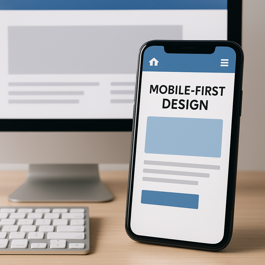
Developing a Responsive Website: How I Would Organize the Process to Create Strategy, Not Chaos
The Responsive Website Development Process: Steps That Keep the Project on Track
If I were to build development of an adaptive website For a business in Ukraine, starting from scratch, I wouldn't start with choosing a CMS theme or saying "design something modern." I'd start with a goal map: which pages should generate leads, which should resolve objections, which should lead to sales. That's strategy, not chaos.
The process then goes like this: analytics → prototype → design system → development → testing on real devices → release and metrics monitoring. Important: mobile-first design is already included at the prototype stage, when we decide what the user will see first on the smartphone and what the shortest path to action will be.
What exactly do we do at each stage (without “magic buttons”)
1) Analytics. Traffic sources, devices, top landing pages, funnel, exit points, competitors in search results. If there is no analytics, we collect a database: GA4/Tag Manager, events, microconversions.
2) Prototype. Scenarios: search → card → cart; or service → case studies → form. This is where the decision is made whether the traffic will convert or just "pretty but confusing."
3) Design system. Buttons, fields, grid, typography, error conditions. It saves weeks of revisions and reduces the risk of creating "every page is a new style because the designer got inspired."
4) Development. Semantic layout, image optimization, correct forms, and technical support for SEO for businesses.
5) Testing. Not just "it works on my Mac." We test iOS/Android, different browsers, speed, clickability, and input.
Common mistakes I've seen (and yes, it hurts)
From practice: the most expensive mistakes are those that seem like “little things,” but ruin conversion.
- Menus and filters that take on a life of their own on mobile devices open up and obscure the “Buy” button.
- The form has 9 fields where only 2 are needed. The “Fax” field is especially touching.
- Pop-ups that are difficult to close with a finger, causing the user to close the entire site, are also a solution.
- Heavy banners on the first screen: the site loads as if it's driving through the Carpathians with the handbrake on.
After the release, we record basic metrics (speed, conversion, applications, behavior) and then integrate systematic website promotion: content, internal optimization, link building—but on a foundation that doesn't fall apart on a smartphone.
Technical Foundation: Speed, Core Web Vitals, Images, and Mobile-Friendly Traps That Are Eating Sales
Speed and Core Web Vitals: When a "little bit slow" becomes a negative for applications
The technical foundation is something users rarely praise, but always criticize. This is especially true on mobile: the network can be unstable, the device isn't a flagship, and the user has as little time as a delivery driver. Therefore, mobile first design Without speed, it's like a display case without a door: it looks nice, but you can't get inside.
Core Web Vitals (LCP, INP, CLS) aren't "scary acronyms for developers," but rather straightforward concepts: how quickly the main content appears, how quickly the site responds to actions, and whether the layout jumps during loading. These factors influence user behavior, and user behavior is one of the factors that indirectly supports increased visibility in Google and organic traffic.
"The user doesn't think, 'Your CLS is bad.' They think, 'This site is annoying,' and they close it."
Practical solutions: what to optimize first
If you want a system, not chaos, I'd start with what produces the greatest impact quickly: images, fonts, critical CSS, JS, and caching. This is usually where the mobile traps that eat away at sales are hidden.
- Images: WebP/AVIF, correct dimensions, lazy-load below the first screen, responsive images via srcset/sizes, so that the mobile device doesn't download the "3000px banner."
- CSS: move critical CSS to head, defer the rest; fewer heavy libraries for the sake of "one button with a shadow."
- JavaScript: removing unused stuff, defer/async, less third-party scripts (especially widgets that load like a little spaceship).
- Fonts: limit families and font styles, preload for key ones, font-display: swap so that the text appears immediately.
- Caching: correct Cache-Control, CDN if necessary, Brotli/Gzip compression.
Forms, Masks, and Click-Through: Where Mobile Conversions Die
Even a fast website can lose money on simple things: forms and interactivity. Check that input masks don't interfere with the phone (especially on iOS), that field types (tel, email) are selected correctly, and that the keyboard doesn't obscure the submit button. Clickable elements should have an adequate hit zone and avoid "double-clicks on a link because it's too small."
This is also important for SEO for businesses: when a mobile user easily submits a request, you get traffic that converts, and you back up your systematic website promotion with real results, not just fancy reports.

Mobile Content and Interfaces: How to Create Content That Drives Sales
Mobile Page Structure: One Screen, One Message
Mobile-first content design begins with discipline: on the first screen, the user must understand where they've landed, what you're offering, and what to do next. On mobile, there's no patience for "warming up through beauty"—there's a task and a thumb.
The typical structure for a service or store is as follows: a specific headline → 1–2 key benefits → price/terms (if applicable) → main CTA → trust block → details. And an important point for Ukraine: immediately show the methods of communication that are actually used (phone, Telegram/Viber) and the delivery/payment terms in clear language, without saying "check with the manager."
"On mobile, content isn't read—it's scanned. Help the eye, and it'll guide the finger to the button."
Product/Service Cards, CTAs, and Trust: What's Driving Sales Right Now
A mobile card isn't a mini-encyclopedia. It's a decision-making tool. If people can't quickly compare options, see availability/timeframes, and understand the final cost, they'll go somewhere easier. We typically emphasize three things in interfaces: clarity, manageability, and trust.
- CTA: The action button is visible and clear ("Buy," "Get Quote," "Sign Up"), without the "Submit" mentality. A pinned button at the bottom of the screen often improves conversions.
- Trust: payment (card/cash on delivery/cashless), delivery (Nova Poshta/courier/pick-up), warranty/return, availability, terms - in compact blocks, and not in the footer in small print.
- Content: short descriptions + "expand", photos without "kilogram" galleries, reviews - closer to the CTA.
"If delivery terms are hidden, the user doesn't think, 'How interesting.' They think, 'It must be expensive/take a long time.'"
Menus, filters, and local scenarios in Ukraine: to avoid losing traffic in navigation
The most common mobile failure is navigation, which hinders purchases: three-level menus, half-screen filters, sorting that resets, and a search that's unforgiving of typos. For Ukraine, it's also important to consider local scenarios: searching by city/district, availability at a specific branch/warehouse, and the ability to quickly check availability in messenger.
The connection to systematic website promotion is direct: when content and interfaces help users complete a task, you get traffic that converts and reinforce your business SEO not with "words in the text," but with behavioral signals and repeat visits.
FAQ: Quick Answers on Mobile-First Design and Adaptive Website Development
What to choose: mobile first design or a separate mobile version?
For most commercial projects in Ukraine, it makes more sense to create a single responsive website with a mobile-first design approach than to maintain a separate mobile version (for example, m.site.ua). A separate version may make sense in rare cases: when the product is highly specialized, there are different scenarios for mobile and desktop users, and you are willing to pay for dual development, testing, and support. In reality, "two versions" often turn into two sources of bugs and two places where you might forget to update content.
How does this impact SEO and organic traffic growth?
Directly and indirectly. Directly, through technical quality: speed, layout stability, ease of interaction on mobile, correct meta tags, and indexing. Indirectly, through behavior: if a mobile user quickly finds what they need and doesn't bounce, behavioral signals improve, and the site is easier to systematically develop through content and internal optimization. It's important to understand: effective SEO — this isn't just a simple "mobile-first" switch, and tomorrow your traffic doubles, but a foundation for systematic website promotion.
In short: a good mobile experience increases the chances that the traffic you've already generated (SEO/advertising/social media) will survive until an application or purchase.
How long does it take, what KPIs should I look at, and what should I do with the old website?
Timelines depend on the scope: a landing page can be developed faster, while an online store with filters and integrations takes longer. In practice, an adequate approach includes analytics, a prototype, a design system, development, testing on real devices, and release. If you're promised "a rebuild in a week, no questions asked," it's often not an acceleration, but rather skipping steps that later lead to bugs.
"You can only test a hypothesis quickly. Doing something reliably always requires a bit of discipline."
KPIs I'd look at include mobile traffic conversion, bounce rate and page depth, speed and Core Web Vitals, visibility and click rates in Search Console, and form metrics (started/submitted). Testing should be done on real iOS/Android devices, in different browsers, with different scenarios (search, filters, shopping cart, phone calls, messenger). With an old website, there are usually two options: a careful, step-by-step modernization of key pages or a full-fledged redesign/migration while maintaining SEO (redirects, structure, content, metadata). The choice depends on how well the "old foundation" can handle the load.

Conclusion: Mobile-First as the basis for digital business growth, not a buzzword
Mobile-first design + responsive website development = control, not hope
Strip away the marketing fluff, mobile-first design is a way to regain control over how people actually use your website. In Ukraine, mobile traffic is the primary driver for most niches, and it's where the decision is made whether there'll be an application/purchase or whether it'll be "I'll do it later from my computer." Spoiler: "later" rarely happens.
When a responsive website is developed correctly, you control two key levers for digital business growth: conversion and Google visibility. Conversion increases not because "we designed it beautifully," but because there's less friction in the scripts, faster loading times, clearer CTAs, and greater trust. Visibility grows more steadily because the technical foundation and user experience support systematic website promotion: content, on-page optimization, and link building—without unnecessary hype or promises of "magic."
Practical steps for the next 2-4 weeks (realistic and to the point)
If you need to move forward now, you don't necessarily have to "redesign everything" in one go. Most projects can be built with a quick improvement plan and yield measurable results.
- Week 1: Mobile scenarios and analytics audit (GA4/Search Console), identifying 3-5 pages where users are lost the most; speed measurement and Core Web Vitals.
- Week 2: Prototype of mobile-first edits: first screen, CTA, forms, trust blocks (payment/delivery/guarantees), simplified navigation/filters.
- Week 3: Technical optimization: images (WebP/AVIF + srcset), fonts, caching, critical CSS, careful handling of JS and third-party scripts.
- Week 4: testing on real devices, release, KPI monitoring (mobile conversion, form events, speed, key page metrics).
Web-Raketa's position: effective SEO starts with the foundation
At Web-Raketa, we don't sell "magic settings." We build a transparent approach to promotion: first, the foundation (speed, mobile scenarios, structure, and content), then systematic work to increase organic traffic and improve visibility in Google. That's what it means. effective SEO: when traffic arrives, understands, trusts, and converts, and the business achieves predictable digital growth—step by step, not on promises.







 Russian
  English
  Ukrainian
  German